pacman::p_load(plotly, ggtern, tidyverse)Hands_on-Exercise_9.1
Creating Ternary Plot with R
1 Overview
Ternary plots are a way of displaying the distribution and variability of three-part compositional data. (For example, the proportion of aged, economy active and young population or sand, silt, and clay in soil.) It’s display is a triangle with sides scaled from 0 to 1. Each side represents one of the three components. A point is plotted so that a line drawn perpendicular from the point to each leg of the triangle intersect at the component values of the point.
In this hands-on, you will learn how to build ternary plot programmatically using R for visualising and analysing population structure of Singapore.
The hands-on exercise consists of four steps:
- Install and launch tidyverse and ggtern packages.
- Derive three new measures using mutate() function of dplyr package.
- Build a static ternary plot using ggtern() function of ggtern package.
- Build an interactive ternary plot using plot-ly() function of Plotly R package.
2 Installing and launching R packages
For this exercise, two main R packages will be used in this hands-on exercise, they are:
- ggtern, a ggplot extension specially designed to plot ternary diagrams. The package will be used to plot static ternary plots.
- Plotly R, an R package for creating interactive web-based graphs via plotly’s JavaScript graphing library, plotly.js . The plotly R libary contains the ggplotly function, which will convert ggplot2 figures into a Plotly object.
We will also need to ensure that selected tidyverse family packages namely: readr, dplyr and tidyr are also installed and loaded.
The code chunks below will accomplish the task.
3 Data Preparation
3.1 The data
For the purpose of this hands-on exercise, the Singapore Residents by Planning AreaSubzone, Age Group, Sex and Type of Dwelling, June 2000-2018 data will be used. The data set has been downloaded and included in the data sub-folder of the hands-on exercise folder. It is called respopagsex2000to2018_tidy.csv and is in csv file format.
3.2 Importing Data
To important respopagsex2000to2018_tidy.csv into R, read_csv() function of readr package will be used.
Code
pop_data <- read_csv("data/respopagsex2000to2018_tidy.csv") Rows: 108126 Columns: 5
── Column specification ────────────────────────────────────────────────────────
Delimiter: ","
chr (3): PA, SZ, AG
dbl (2): Year, Population
ℹ Use `spec()` to retrieve the full column specification for this data.
ℹ Specify the column types or set `show_col_types = FALSE` to quiet this message.3.3 Preparing the Data
Next, use the mutate() function of dplyr package to derive three new measures, namely: young, active, and old.
Code
agpop_mutated <- pop_data %>%
  mutate(`Year` = as.character(Year))%>%
  spread(AG, Population) %>%
  mutate(YOUNG = rowSums(.[4:8]))%>%
  mutate(ACTIVE = rowSums(.[9:16]))  %>%
  mutate(OLD = rowSums(.[17:21])) %>%
  mutate(TOTAL = rowSums(.[22:24])) %>%
  filter(Year == 2018)%>%
  filter(TOTAL > 0)
4 Plotting Ternary Diagram with R
4.1 Plotting a static ternary diagram
Use ggtern() function of ggtern package to create a simple ternary plot.
Code
#Building the static ternary plot
ggtern(data=agpop_mutated,aes(x=YOUNG,y=ACTIVE, z=OLD)) +
  geom_point()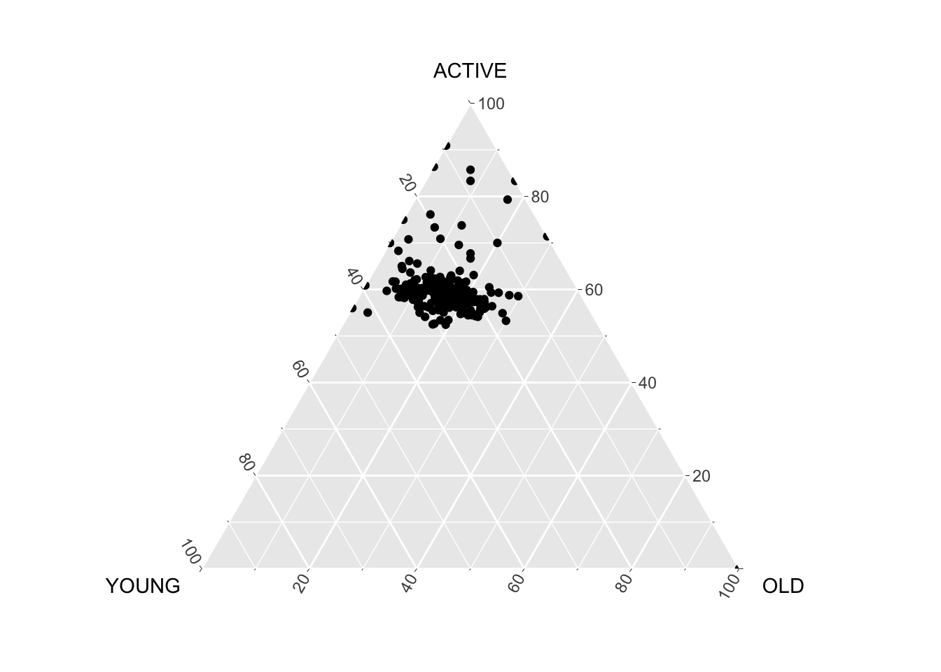
Code
#Building the static ternary plot
ggtern(data=agpop_mutated, aes(x=YOUNG,y=ACTIVE, z=OLD)) +
  geom_point() +
  labs(title="Population structure, 2015") +
  theme_rgbw()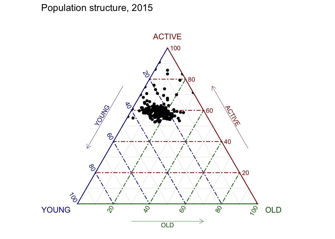
4.2 Plotting an interative ternary diagram
The code below create an interactive ternary plot using plot_ly() function of Plotly R.
Code
# reusable function for creating annotation object
label <- function(txt) {
  list(
    text = txt,
    x = 0.1, y = 1,
    ax = 0, ay = 0,
    xref = "paper", yref = "paper",
    align = "center",
    font = list(family = "serif", size = 15, color = "white"),
    bgcolor = "#b3b3b3", bordercolor = "black", borderwidth = 2
  )
}

# reusable function for axis formatting
axis <- function(txt) {
  list(
    title = txt, tickformat = ".0%", tickfont = list(size = 10)
  )
}

ternaryAxes <- list(
  aaxis = axis("Young"),
  baxis = axis("Active"),
  caxis = axis("Old")
)

# Initiating a plotly visualization
plot_ly(
  agpop_mutated,
  a = ~YOUNG,
  b = ~ACTIVE,
  c = ~OLD,
  color = I("black"),
  type = "scatterternary"
) %>%
  layout(
    annotations = label("Ternary Markers"),
    ternary = ternaryAxes
  )
4.2.1 Ternary Plot with Customized Fonts and Styling
#| echo: true
#| code-fold: true
#| message: false
#| warning: false


label <- function(txt) {
  list(
    text = txt,
    x = 0.1, y = 1,
    ax = 0, ay = 0,
    xref = "paper", yref = "paper",
    align = "center",
    font = list(family = "serif", size = 15, color = "white"),
    bgcolor = "#b3b3b3",
    bordercolor = "black",
    borderwidth = 2
  )
}

axis <- function(txt, col) {
  list(
    title = list(text = txt, font = list(color = col)),
    tickformat = ".0%",
    tickfont = list(size = 10, color = col),
    linecolor = col
  )
}

ternaryAxes <- list(
  aaxis = axis("Young", "darkblue"),
  baxis = axis("Active", "darkred"),
  caxis = axis("Old", "darkgreen")
)

plot_ly(
  agpop_mutated,
  a = ~YOUNG,
  b = ~ACTIVE,
  c = ~OLD,
  type = "scatterternary",
  mode = "markers",
  color = I("black"),
  hovertemplate = paste(
    "Young:  %{a:.0%}",
    "<br>Active: %{b:.0%}",
    "<br>Old:    %{c:.0%}",
    "<extra></extra>"
  )
) %>%
  layout(
    title = list(text = "Population structure, 2015"),
    annotations = label("Ternary Markers"),
    ternary = ternaryAxes,
    margin = list(t = 90)
  )