Code
pacman::p_load(seriation, dendextend, heatmaply, tidyverse)Heatmap for Visualising and Analysing Multivariate Data
Heatmaps visualise data through variations in colouring. When applied to a tabular format, heatmaps are useful for cross-examining multivariate data, through placing variables in the columns and observation (or records) in rowa and colouring the cells within the table. Heatmaps are good for showing variance across multiple variables, revealing any patterns, displaying whether any variables are similar to each other, and for detecting if any correlations exist in-between them.
In this hands-on exercise, you will gain hands-on experience on using R to plot static and interactive heatmap for visualising and analysing multivariate data.
We will install and launch seriation, heatmaply, dendextend and tidyverse in RStudio.
pacman::p_load(seriation, dendextend, heatmaply, tidyverse)we will use World Happines 2018 report data set. The data set is downloaded from here. The original data set is in Microsoft Excel format. It has been extracted and saved in csv file called WHData-2018.csv.
In the code chunk below, read_csv() of readr is used to import WHData-2018.csv into R and parsed it into tibble R data frame format.
wh <- read_csv("data/WHData-2018.csv")Rows: 156 Columns: 12
── Column specification ────────────────────────────────────────────────────────
Delimiter: ","
chr (2): Country, Region
dbl (10): Happiness score, Whisker-high, Whisker-low, Dystopia, GDP per capi...
ℹ Use `spec()` to retrieve the full column specification for this data.
ℹ Specify the column types or set `show_col_types = FALSE` to quiet this message.The output tibbled data frame is called wh.
Next, we need to change the rows by country name instead of row number by using the code chunk below
row.names(wh) <- wh$CountryNotice that the row number has been replaced into the country name.
row.names(wh) <- wh$CountryThe data was loaded into a data frame, but it has to be a data matrix to make your heatmap.
The code chunk below will be used to transform wh data frame into a data matrix.
wh1 <- dplyr::select(wh, c(3, 7:12))
wh_matrix <- data.matrix(wh)
Notice that wh_matrix is in R matrix format.
There are many R packages and functions can be used to drawing static heatmaps, they are:
In this section, you will learn how to plot static heatmaps by using heatmap() of R Stats package.
In this sub-section, we will plot a heatmap by using heatmap() of Base Stats. The code chunk is given below.
wh_heatmap <- heatmap(wh_matrix,
                      Rowv=NA, Colv=NA)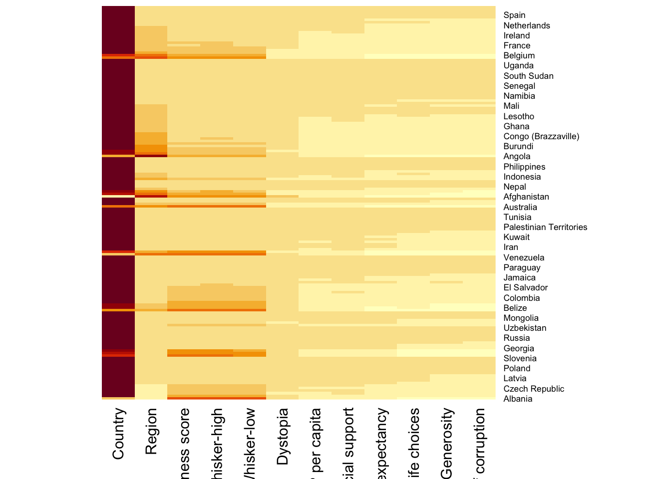
Note:
To plot a cluster heatmap, we just have to use the default as shown in the code chunk below.
wh_heatmap <- heatmap(wh_matrix)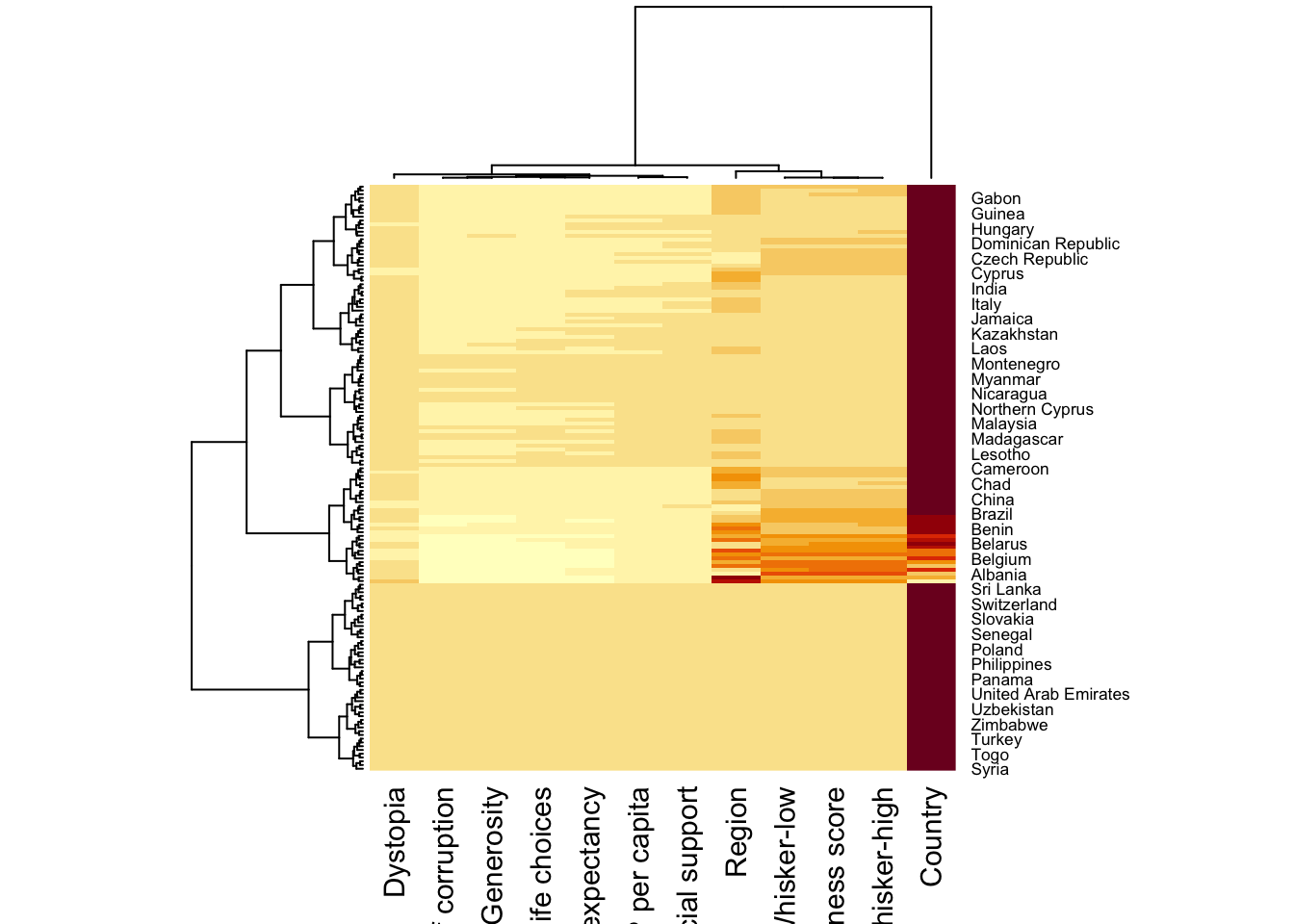
Note:
Here, red cells denotes small values, and red small ones. This heatmap is not really informative. Indeed, the Happiness Score variable have relatively higher values, what makes that the other variables with small values all look the same. Thus, we need to normalize this matrix. This is done using the scale argument. It can be applied to rows or to columns following your needs.
The code chunk below normalises the matrix column-wise.
wh_heatmap <- heatmap(wh_matrix,
                      scale="column",
                      cexRow = 0.6,
                      cexCol = 0.8,
                      margins = c(10, 4))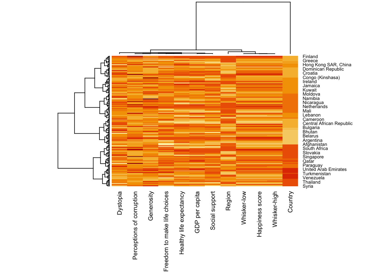
Notice that the values are scaled now. Also note that margins argument is used to ensure that the entire x-axis labels are displayed completely and, cexRow and cexCol arguments are used to define the font size used for y-axis and x-axis labels respectively.
heatmaply is an R package for building interactive cluster heatmap that can be shared online as a stand-alone HTML file. It is designed and maintained by Tal Galili.
Before we get started, you should review the Introduction to Heatmaply to have an overall understanding of the features and functions of Heatmaply package. You are also required to have the user manualof the package handy with you for reference purposes.
In this section, you will gain hands-on experience on using heatmaply to design an interactive cluster heatmap. We will still use the wh_matrix as the input data.
heatmaply(mtcars)Warning in doTryCatch(return(expr), name, parentenv, handler): unable to load shared object '/Library/Frameworks/R.framework/Resources/modules//R_X11.so':
dlopen(/Library/Frameworks/R.framework/Resources/modules//R_X11.so, 0x0006): Library not loaded: /opt/X11/lib/libSM.6.dylib
Referenced from: <34C5A480-1AC4-30DF-83C9-30A913FC042E> /Library/Frameworks/R.framework/Versions/4.4-arm64/Resources/modules/R_X11.so
Reason: tried: '/opt/X11/lib/libSM.6.dylib' (no such file), '/System/Volumes/Preboot/Cryptexes/OS/opt/X11/lib/libSM.6.dylib' (no such file), '/opt/X11/lib/libSM.6.dylib' (no such file), '/Library/Frameworks/R.framework/Resources/lib/libSM.6.dylib' (no such file), '/Library/Java/JavaVirtualMachines/jdk-11.0.18+10/Contents/Home/lib/server/libSM.6.dylib' (no such file)The code chunk below shows the basic syntax needed to create n interactive heatmap by using heatmaply package.
heatmaply(wh_matrix[, -c(1, 2, 4, 5)])Note that:
When analysing multivariate data set, it is very common that the variables in the data sets includes values that reflect different types of measurement. In general, these variables’ values have their own range. In order to ensure that all the variables have comparable values, data transformation are commonly used before clustering.
Three main data transformation methods are supported by heatmaply(), namely: scale, normalise and percentilse.
The code chunk below is used to scale variable values columewise.
heatmaply(wh_matrix[, -c(1, 2, 4, 5)],
scale = "column")Different from Scaling, the normalise method is performed on the input data set i.e. wh_matrix as shown in the code chunk below.
heatmaply(normalize(wh_matrix[, -c(1, 2, 4, 5)]))Similar to Normalize method, the Percentize method is also performed on the input data set i.e. wh_matrix as shown in the code chunk below.
heatmaply(percentize(wh_matrix[, -c(1, 2, 4, 5)]))heatmaply supports a variety of hierarchical clustering algorithm. The main arguments provided are:
In general, a clustering model can be calibrated either manually or statistically.
In the code chunk below, the heatmap is plotted by using hierachical clustering algorithm with “Euclidean distance” and “ward.D” method.
heatmaply(normalize(wh_matrix[, -c(1, 2, 4, 5)]),
          dist_method = "euclidean",
hclust_method = "ward.D")In order to determine the best clustering method and number of cluster the dend_expend() and find_k() functions of dendextend package will be used.
First, the dend_expend() will be used to determine the recommended clustering method to be used.
wh_d <- dist(normalize(wh_matrix[, -c(1, 2, 4, 5)]), method = "euclidean")
dend_expend(wh_d)[[3]]
dist_methods hclust_methods optim
1 unknown ward.D 0.6137851
2 unknown ward.D2 0.6289186
3 unknown single 0.4774362
4 unknown complete 0.6434009
5 unknown average 0.6701688
6 unknown mcquitty 0.5020102
7 unknown median 0.5901833
8 unknown centroid 0.6338734The output table shows that “average” method should be used because it gave the high optimum value.
Next, find_k() is used to determine the optimal number of cluster.
wh_clust <- hclust(wh_d, method = "average")
num_k <- find_k(wh_clust)
plot(num_k)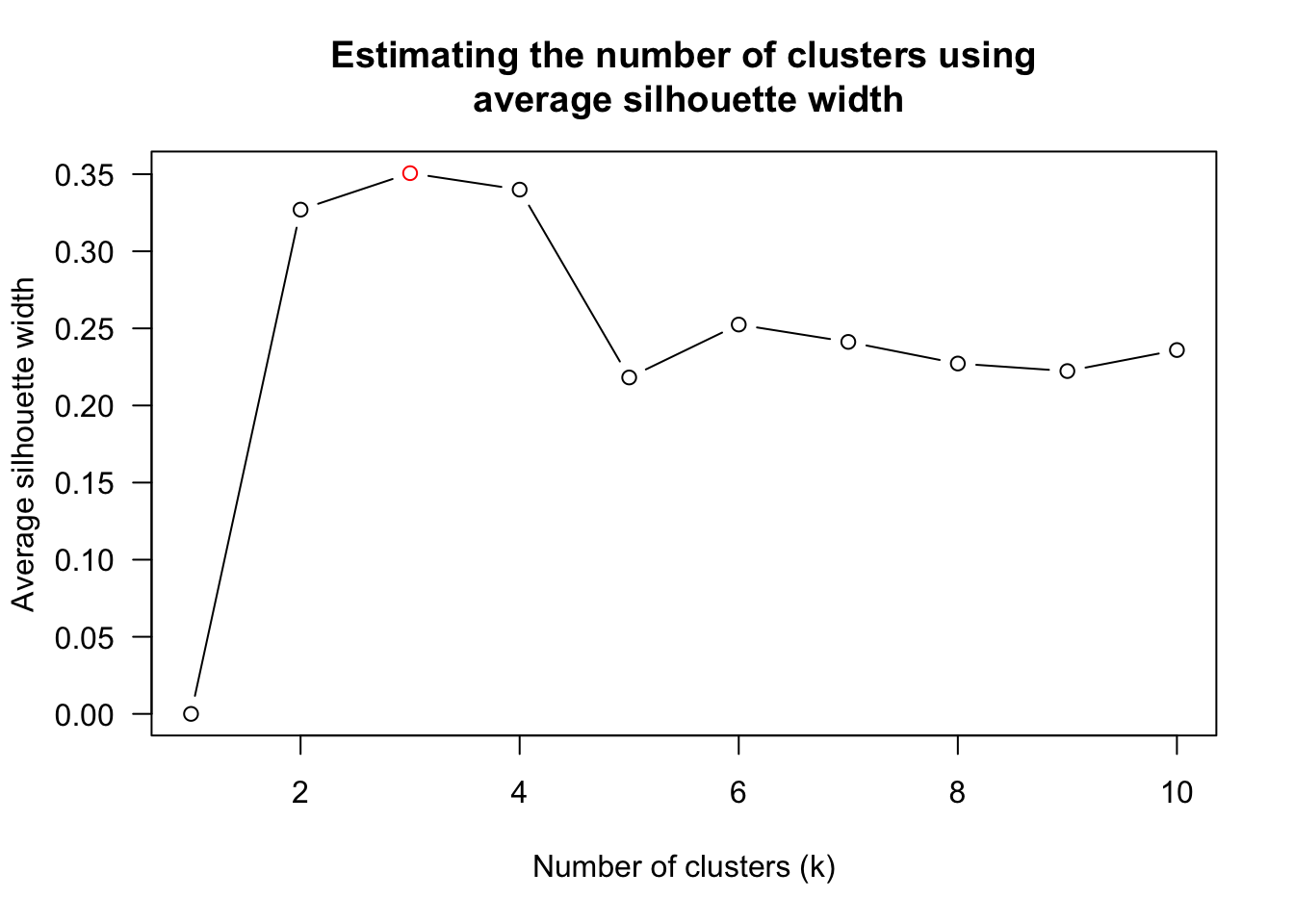
Figure above shows that k=3 would be good.
With reference to the statistical analysis results, we can prepare the code chunk as shown below.
heatmaply(normalize(wh_matrix[, -c(1, 2, 4, 5)]),
          dist_method = "euclidean",
          hclust_method = "average",
k_row = 3)One of the problems with hierarchical clustering is that it doesn’t actually place the rows in a definite order, it merely constrains the space of possible orderings. Take three items A, B and C. If you ignore reflections, there are three possible orderings: ABC, ACB, BAC. If clustering them gives you ((A+B)+C) as a tree, you know that C can’t end up between A and B, but it doesn’t tell you which way to flip the A+B cluster. It doesn’t tell you if the ABC ordering will lead to a clearer-looking heatmap than the BAC ordering.
heatmaply uses the seriation package to find an optimal ordering of rows and columns. Optimal means to optimize the Hamiltonian path length that is restricted by the dendrogram structure. This, in other words, means to rotate the branches so that the sum of distances between each adjacent leaf (label) will be minimized. This is related to a restricted version of the travelling salesman problem.
Here we meet our first seriation algorithm: Optimal Leaf Ordering (OLO). This algorithm starts with the output of an agglomerative clustering algorithm and produces a unique ordering, one that flips the various branches of the dendrogram around so as to minimize the sum of dissimilarities between adjacent leaves. Here is the result of applying Optimal Leaf Ordering to the same clustering result as the heatmap above.
heatmaply(normalize(wh_matrix[, -c(1, 2, 4, 5)]),
          seriate = "OLO")
The default options is “OLO” (Optimal leaf ordering) which optimizes the above criterion (in O(n^4)). Another option is “GW” (Gruvaeus and Wainer) which aims for the same goal but uses a potentially faster heuristic.
heatmaply(normalize(wh_matrix[, -c(1, 2, 4, 5)]),
          seriate = "GW")
Registered S3 method overwritten by 'gclus':
method from
reorder.hclust seriationThe option “mean” gives the output we would get by default from heatmap functions in other packages such as gplots::heatmap.2.
heatmaply(normalize(wh_matrix[, -c(1, 2, 4, 5)]),
          seriate = "mean")
The option “none” gives us the dendrograms without any rotation that is based on the data matrix.
heatmaply(normalize(wh_matrix[, -c(1, 2, 4, 5)]),
seriate = "none")The default colour palette uses by heatmaply is viridis. heatmaply users, however, can use other colour palettes in order to improve the aestheticness and visual friendliness of the heatmap.
In the code chunk below, the Blues colour palette of rColorBrewer is used
heatmaply(normalize(wh_matrix[, -c(1, 2, 4, 5)]),
          seriate = "none",
colors = Blues)Beside providing a wide collection of arguments for meeting the statistical analysis needs, heatmaply also provides many plotting features to ensure cartographic quality heatmap can be produced.
In the code chunk below the following arguments are used:
heatmaply(normalize(wh_matrix[, -c(1, 2, 4, 5)]),
          Colv=NA,
          seriate = "none",
          colors = Blues,
          k_row = 5,
          margins = c(NA,200,60,NA),
          fontsize_row = 4,
          fontsize_col = 5,
          main="World Happiness Score and Variables by Country, 2018 \nDataTransformation using Normalise Method",
          xlab = "World Happiness Indicators",
          ylab = "World Countries"
          )